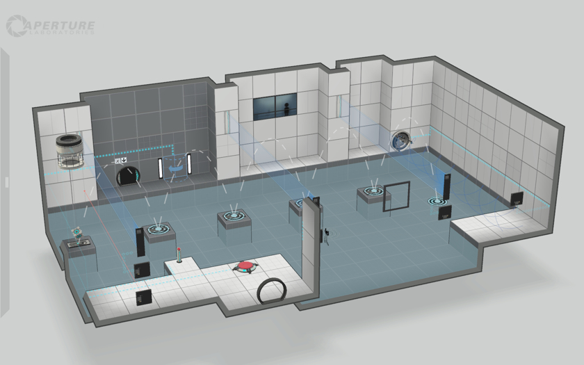
This week saw the release of Valve’s new beginner-friendly level editor for Portal 2, dubbed the “Perpetual Testing Initiative”. Many have praised this new software for its accessibility, and have advocated it as an entry-point for first-time level designers. I had a chance to experiment with it a little myself, and I’d like to explore some of the specific principles Valve employed to create this remarkably approachable editor.
Booting up the editor for the first time gives you a simple rectangular testing chamber. The walls and floors can be dragged in any direction to expand the space or create connected chambers and corridors. Puzzle devices are dragged and dropped into the world from a tidy panel on the left side of the screen (very much like The Incredible Machine.) Right clicking these elements in the world exposes a small selection of options, and allows you to connect them to other devices. Simply moving the camera around the 3D space will likely be the most challenging interaction for a fledgling designer.
The editor is stylized like a blueprint: elements appear simpler than they do in-game, some devices (like the Aerial Faith Plate) project dashed path lines, and ceilings / backward-facing walls are automatically hidden from view. A working knowledge of Portal mechanics is assumed, as there are curiously no tool-tips to explain how the various devices function. Even I had to use trial-and-error to figure out how the Track Platform works, as the official Valve wiki is unfortunately sparse at the time of writing.
A great deal of editor’s simplicity derives from the fact that it’s not a generic tool designed to make levels, but rather a very specific tool to make test chambers. Test chambers in the Portal universe have a well-defined format. They are white, sterile, closed and grid-aligned rooms. They contain some permutation of the 32 devices. They necessarily have exactly one entrance, one exit and one observation room (which functions as the level’s main light source.) These fiction-appropriate constraints keep the editor simple by limiting the number of possible ingredients.
The devices themselves demonstrate a similar simplicity; both input devices (buttons, laser catchers) and output devices (laser emitters, piston platforms, etc.) maintain only binary states. Attaching several inputs to the same device will require them all to be active (logical AND), but there is no sanctioned way to achieve OR, NAND or XOR. Connections between devices are always visible to the player, as the editor automatically generates an in-game dotted line between them. Keeping the interaction between devices simple allows the editor to abstract away from any sort of complex scripting logic.
Fundamentally, the Portal 2 editor works so well because of the judicious use of physical constraints. In The Design of Everyday Things, Donald Norman describes how these types of limitations “constrain possible operations” such that “desired actions can be made obvious.” Since it’s almost impossible to do the wrong thing in this editor, the only possible actions are correct ones. Designers are thus free to experiment without fear of breaking the level in an esoteric way. The only clearly incorrect operation I’ve found is placing two devices in the same spot; the feedback for this error is clear and immediate.
In my few hours of experimentation I made a simple test chamber called “Ducks & Drakes”, which you can download and play by hitting subscribe in the Steam Workshop. You should also check out the Perpetual Testing Challenge over at the MapCore Forums.


